
One of the questions I’m asked most on my Instagram is how to get better at lettering.
The short answer is practice! But once you’re happy with your letterforms, I also wanted to share some cool techniques to help you make it pop. This is the most straightforward lettering, in a pretty colour, but basically a little flat on the page. I see a lot of this and I think there are some cute ways to make it standout more.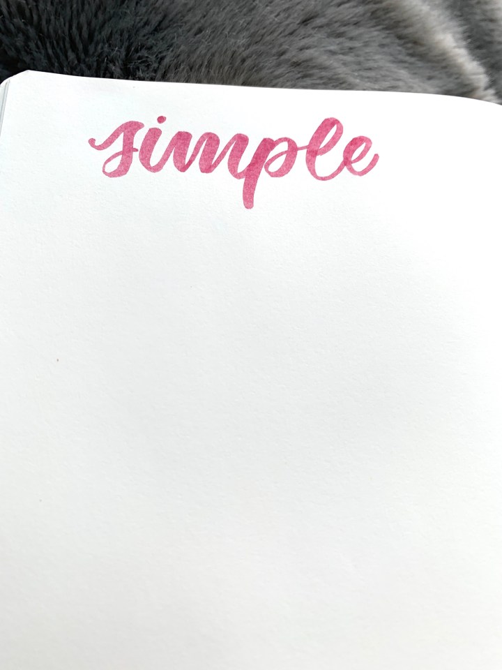
 Here’s the same shade, blended into a lighter shade to add dimension. I especially love using Tombow brush pens for this blend (this is just two pens even though you can see four or five pink tones) but most brush pens or colouring pencils will work.
 Outline shading is probably the lettering technique that took me the longest to learn (it’s a bit fiddly) but it’s now one of my favourite ways to make letters jump off the page. I used a Pigma micron fineliner but a light grey marker also looks really beautiful.
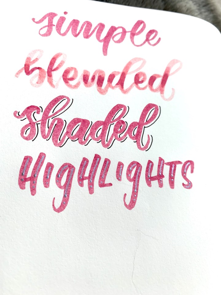 Highlights in metallic or white pen is a great starting point for beginners – just etch down the strokes of your lettering to make the letters jump off the page.
 I wasn’t sure what to call “do it all”, so I went with whole enchilada! Here’s what it looks like if you put blending, shading and highlights together. Pretty popping! I’d love to know if you find this format useful, let me know in the comments or tag me on Instagram.
Thanks for reading,
PlannerPeach xx

Hi, I whould love to see how blended and shaded will look like 🙂 These two is my favorite from the above ❤
LikeLiked by 1 person
Great post. I’ve just started my bullet journal and will definitely be trying these suggestions soon. Thanks for the tips!
LikeLike
Thanks Tubs hope you find it useful!
LikeLike